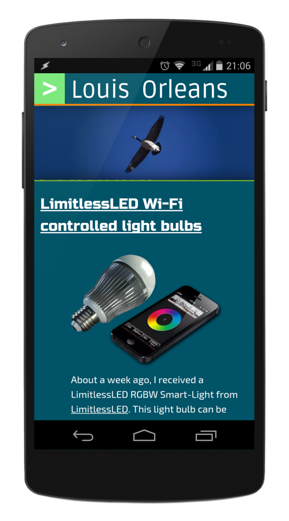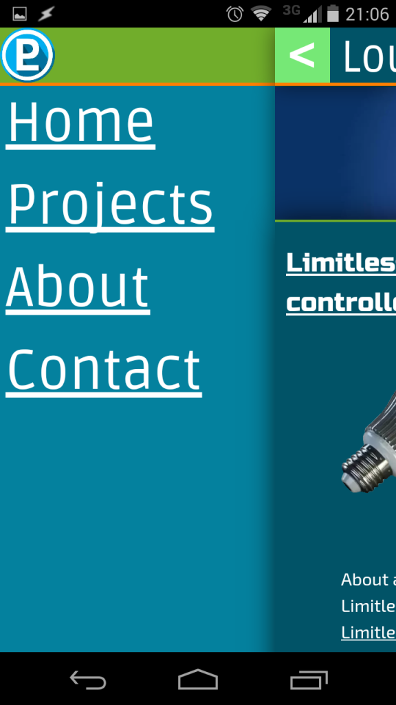
Today, I finished the mobile layout for this site today. It uses pure CSS to make the layout, with a bit of JavaScript to set CSS styles when the user hits the navigation pane expand button (at the top left). The static styles are set with the following CSS selector
 @media screen and (max-width: 899px){

header .top-bar-wide {display: none}

header .top-bar-narrow {display: inline-block;

}
To animate the page sliding to the right to reveal the navigation drawer, I apply a CSS class using some simple JavaScript
document.getElementById('wrapper').className = "slideIn hfeed";
Below are some more pictures of the mobile site.


